Yes, You Can!
My Sister Knits has finally received our shipment of Palette Scout cards! These are an essential tool for anyone who is interested in adding color to a project!
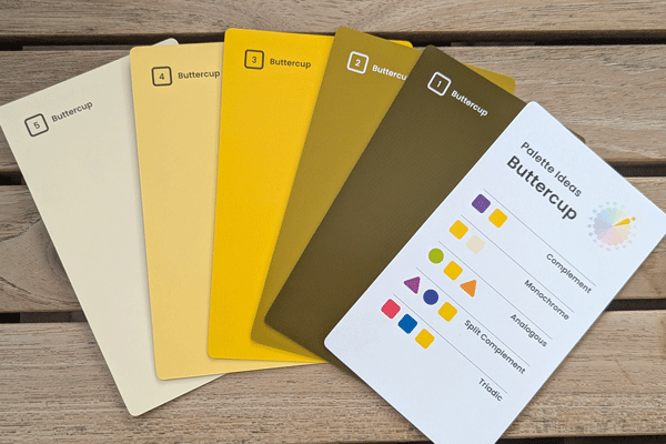
Card number 3 is the base color. Cards 1 and 2 are shades with black added. Cards 4 and 5 are tints with white added. These ‘pure’ intensity cards are used to create cheerful, vivid palettes.
When I wrote about the Doodle card decks, I mentioned that my color theory knowledge is basic at best. Putting colors together intimidates me. Now we have a way for everyone to be able to put together stunning combinations for colorwork! Remember that colorwork includes anything from stripes to mosaic to stranded and beyond.
This deck of color cards will give you so much information! You don’t even have to learn it, just keep the little booklet handy and you’ll have all of the information that you’ll need!
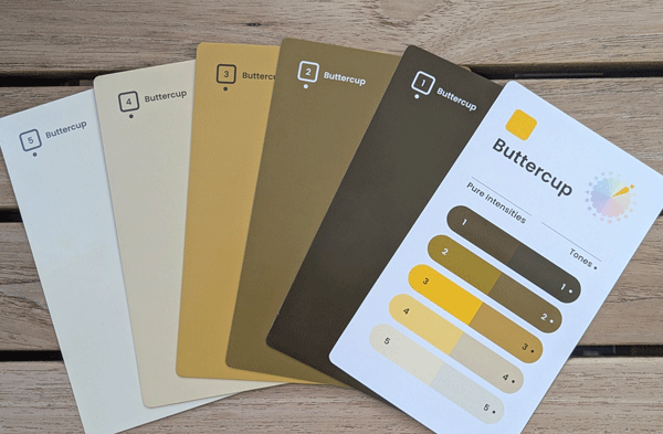
This is the other side of the above cards. Note that there’s a dot by the numbers, meaning that these are tones and have gray added. These colors are used to create muted or somber palettes.
You’ll be able to easily figure out the meaning of color terms such as:
Hue
Value
Intensity
Tint
Shade
and more!
Precise instructions will guide you in creating your first palette, with suggestions on how to make it more eye-catching.
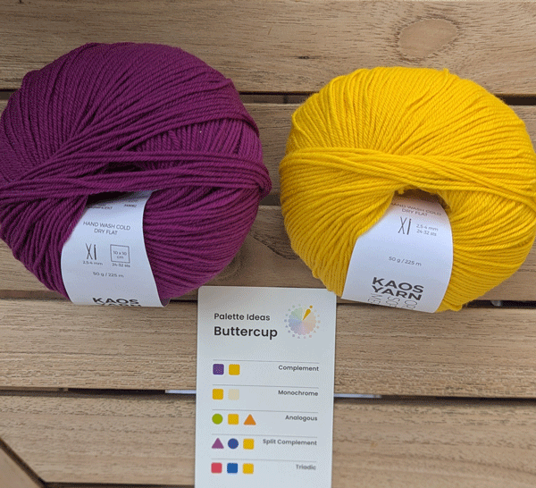
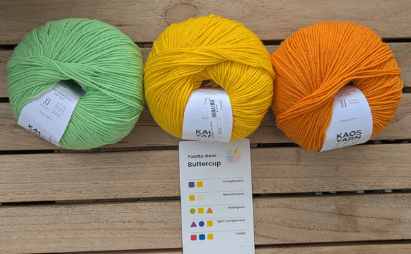
This is a complementary palette and can be used to create high energy, bright designs. Complementary colors are opposites on the color wheel.
There are 18 base colors (hues) in the deck that make up the color wheel. Each base color has 4 other cards with it, 2 are shades that have black added and 2 are tints that have white added. So there are 5 cards for each base color.
Each of these cards are numbered 1-5. One side is the ‘pure’ side. The other side of the cards has a dot by the number. This indicates that the color is a tone, meaning that it has gray added.
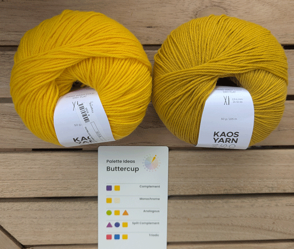
This is a monochrome palette and is good for clean, simple designs. Monochromes use different values of the same hue.
My favorite color is yellow so I decided to play with the 5 Buttercup cards. I wanted to start at the beginning so I only put together color palette ideas from the card for Buttercup. There’s a card with these ideas for each of the colors/hues. I used Kaos yarn because they have so many colors!
This is an analogous palette, good for calm, soothing designs. Analogous colors are close on the color wheel.
Now I’ve done that, I’m ready to become adventurous and use more of the ideas in the booklet! I’ve also thought of other ways to create color palettes. At the moment I have some roses in a vase. Some are creamy white and some are a pale pink with a tiny bit of light green at the edges of the petals. I absolutely love them. So what if I found a yarn, maybe the pink, as my base color, and …. hold on…..
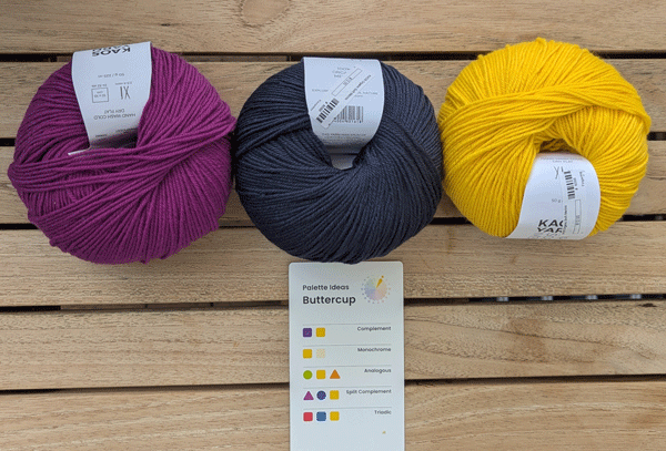
This is a split complement palette, good for designs with harmony and contrast. These palettes use hues (colors) on either side of the complementary color.
I just now stopped writing and looked at the color wheel card, found that the cards for the color Ibis were pink so I pulled them out of the deck. Then I looked at the palette ideas and the first one is pink and green! I went back to the color wheel and saw that the Reed cards were probably the green that I wanted and they are! So now I have choices. I could play with combining pure intensities and the ones on the other sides with the dots.
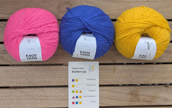
Here we have a Triadic palette, good for contrasting designs with 3 colors. These make a triangle on the color wheel.
Now comes the question of what I’d do with these colors! They seem pretty delicate compared to what I usually wear but a little scarf to wrap around my neck might be nice. But how to get 3 colors into one project? I went to Ravelry and pretty quickly found that Isabell Kraemer has one with stripes and we even have it as a sample in the shop! Even better! I could easily use a creamy white for the background and pink and green for the stripes! Now I want to run back to the shop and see what I can find! See how fun and easy these cards are to use? The possibilities are endless but now they aren’t overwhelming.
We encourage you to come into the shop with enough time to go through our opened sample deck and play with them!
Happy knitting,