Color-Choosing Tips for Colorwork
Note: While I’m away during June, we will be revisiting some blog posts that I think are worth a second look! Those of us at My Sister Knits hope you enjoy them!
Colorwork! Oh, the fun! There are an array of techniques that use different colors in one project: blocks of color, stripes, mosaic, stranded, intarsia, entrelac. All of these will give your project visual interest and it’s so pleasing to watch the design unfold!
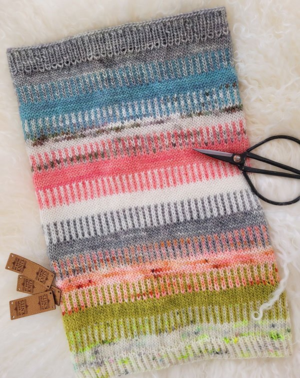
Nova Cowl, designed by Carina Spencer
One thing that often stumps people is the question of which colors to use? How to choose from all of the gorgeousness at My Sister Knits? How do you know if they will look good together?
When you choose a colorwork project, no matter the technique used, you get to go on a treasure hunt. It is helpful to find a color that you love to begin with! This will be your main color. Now you get to choose contrast colors and this is where you can be swamped with choices.
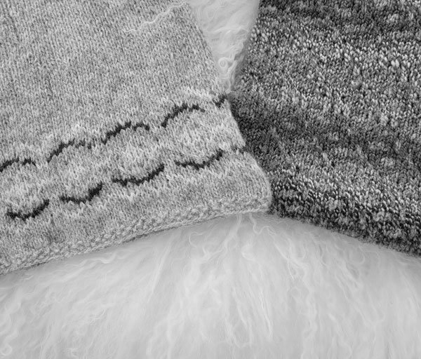
On the left, La petite robe, designed by Anne B Hanssen; on the right, Across the Pond cowl, designed by Andrea Mowry
One the of first decisions to make is if you want the contrast between your colors to be soft or distinct. That choice is yours and will drive your color selection.
Next, we encourage you to find an assortment of other colors that you like. The more colors in your project, the more options you’ll need! We love to help with this so be sure to ask if you’d like more opinions!
This was a kit so the choices were made for you! The Leftover City cowl, designed by Kacey Herlihy
Put the yarns together to see which color combinations pop out at you. More than likely there will be several!
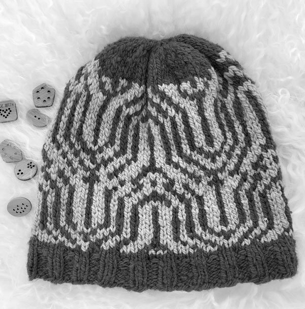
Eyecatcher Hat, designed by Jennifer Berg
Here’s where your phone comes in quite handy! Take a picture of the colors you are considering. Open up that photo and choose the ‘filters’ symbol. You may need to choose the ‘edit’ symbol first. Scroll to the right and you will find the ‘B & W’ filter. Choose that one and, voila!, you will now have a black and white photo of your choices. This will tell you how distinct your chosen color differences will be. The B & W filter is a tremendous asset for this purpose!
When you’re choosing how to pattern colors for a multi-colored project, this is most valuable. If your colors are arranged with not enough distinction between them, you can rearrange as many times as needed until the contrast is exactly what you want!
On a personal note, I did this with colors for a yoke that requires ten (!) colors recently. I spent time arranging and rearranging colors, taking photos, and comparing the contrast until I got them in the exact order I wanted!
Another thing you can do to have confidence with your color selection is to knit a swatch using two-row stripes instead of your colorwork design. Do this using the technique for swatching in the round. This will show you how your choices look together and you can make changes if needed. Now you’re ready to cast on for your project!
Happy knitting,


